Visual hierarchy is the order in which people notice and read the elements of a page, set by how those elements look: their size, weight, colour contrast, position and the space around them. A clear hierarchy makes the most important thing on a page, usually the headline and the main action, the first thing a visitor sees, and lets them scan the rest in a sensible order.
Nielsen Norman Group sums it up as design in which the eye is guided to each element “in the order of intended importance”. Every page has a hierarchy whether anyone planned it or not. The question is whether it matches what the business needs visitors to notice.
How visual hierarchy works
Designers have a small set of tools, and they work together:
- Size. Bigger elements are seen first. A headline set much larger than the body text tells the reader where to start.
- Weight and contrast. Bold type, dark text on a light background or a strong colour against a calm page all draw the eye. What matters is the contrast with the surroundings: a red button stands out on a white page and disappears on a red one.
- Position. In left-to-right languages, people tend to start near the top left. Elements placed high on the page and on the left get looked at earlier.
- Spacing and grouping. Items close together read as one group, and generous white space around an element isolates it and gives it weight.
- Consistency. When every link looks the same and every section heading uses the same style, visitors learn the pattern quickly and can predict what is clickable.
Here is how it looks in practice. Take the top of a page for a boiler repair firm with five pieces of content: the service and town, a line about the engineers, a “Book a visit” button, opening hours and prices, and customer reviews.
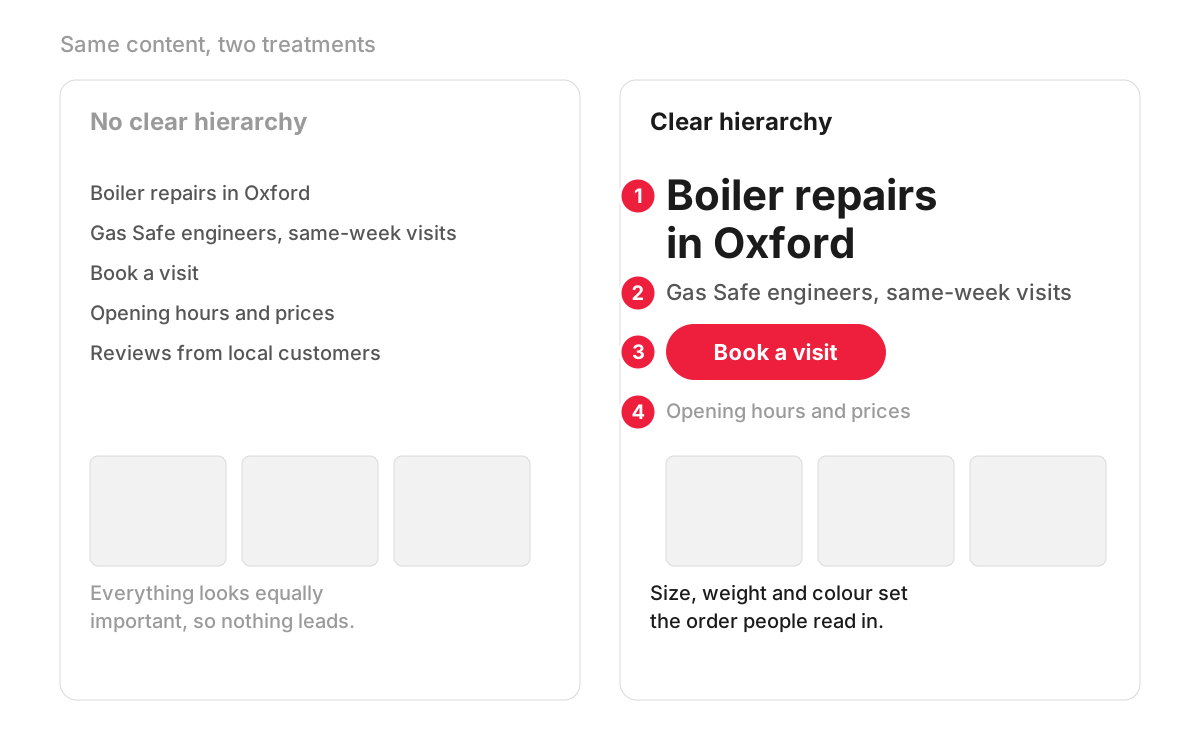
On the left, every line is set in the same size and colour, so the button reads like plain text and nothing leads. On the right, the headline is large and bold (1), the supporting line is smaller and grey (2), the button is the only red element (3), and the details sit quietly below (4). The content has not changed, only the order in which it is noticed.
Why it matters for a business website
Most visitors do not read a page from top to bottom. In Nielsen Norman Group’s eye-tracking research, people scan, and the most effective way to scan is the layer-cake pattern, where the eye moves from heading to heading and stops to read only the section it needs. Clear visual hierarchy is what makes that possible.
For a business, that has direct consequences:
- Enquiries. If the phone number, the price or the booking button does not stand out, some visitors leave without finding it. Improving that is a large part of conversion rate optimisation.
- The first screen. Hierarchy decides whether the offer and the main action are clear above the fold, before anyone scrolls.
- Trust. A page where everything shouts looks like a sales flyer. A calm page with one clear focus looks considered.
Visual hierarchy and heading structure
What people see and what the code says should match. The biggest heading on the page should be the H1, section titles H2, and subsections H3. The W3C’s guidance on page structure asks authors to nest headings by their rank and avoid skipping levels where possible, because browsers and assistive technologies such as screen readers use headings to let people move around a page.
Two habits break this link. One is choosing a heading tag for its size (“make this an H4, it’s smaller”), which produces a jumbled outline. The other is styling ordinary paragraphs to look like headings, which leaves them invisible to assistive technology. Size should be set in the styles and the tag chosen by meaning. More on why this matters in our entry on web accessibility.
Common hierarchy problems and quick checks
The same problems turn up on many business sites:
- several buttons of equal weight competing for the same spot, so none of them reads as the main action;
- bold, capitals and colour used so often that emphasis stops meaning anything;
- a slider, video or animation at the top that pulls attention away from the offer;
- key details such as prices or delivery terms set in pale grey small print;
- a hierarchy that works on desktop and falls apart on a phone, where a sidebar with the contact details drops to the bottom of the page. That is a responsive design problem as much as a visual one.
Two quick checks help. Step back from the screen or blur your eyes: the shapes you still see should be the ones that matter most. Then show the page to someone for five seconds and ask what it offers and what they would click. If they cannot say, the hierarchy needs work.
How we work with it
Hierarchy is easiest to settle before colours and photos arrive. In our web design projects we make wireframes and clickable prototypes in Figma, so the order of headline, offer and main button is agreed in grey boxes first. On a live site, our UX audit uses session recordings and heatmaps where Microsoft Clarity or Hotjar is connected, which shows where people actually click and how far they scroll, and you receive screenshots of each problem with a recommendation.
FAQ
What are the principles of visual hierarchy?
There is no single official list, which is why articles quote anything from five to twelve principles. Most of them come down to the same handful: size, colour and contrast, typography, spacing, alignment, proximity, repetition and position on the page. A designer rarely uses one alone; a headline usually stands out through size, weight and the space around it at the same time.
What is the difference between visual hierarchy and information hierarchy?
Information hierarchy is the order of importance of the content itself: what a page must say first, second and third. Visual hierarchy is how the design expresses that order on screen. You decide the information hierarchy when you plan the page, often in a wireframe, and the visual design then makes it visible.
Is visual hierarchy part of UX or UI design?
Both. User experience design decides what matters most on each page and in what order, based on what visitors are trying to do. User interface design turns that order into sizes, colours, type and spacing. In smaller teams one designer handles both.
How do you test visual hierarchy on a live page?
Heatmaps and scroll maps show where visitors click and how far down they get, and session recordings show whether they hesitate or miss the main button. A simple five-second test with a few people outside the business is also revealing. If you change the hierarchy, compare the before and after on the same measure, such as clicks on the main button or completed forms.