516
How to Create a Landing Page: Structure, Design and Tips
A well-made landing page turns visitors from an ad or an email into enquiries, sign-ups or sales. This guide explains how to create a landing page step by step: what it is, which type you need, how to structure the page, and how to choose the layout, colours, images and call to action. If you would rather have the page built for you, see our landing page design and development service.
What Is a Landing Page?
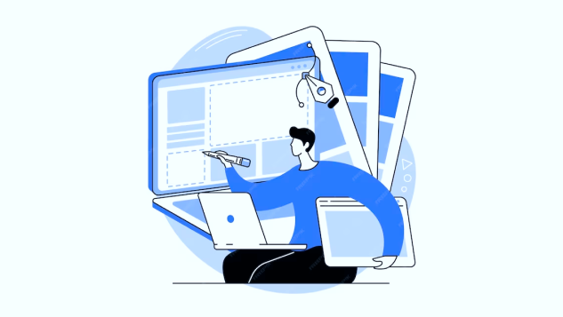
A landing page is a standalone web page that people reach by clicking a link in an ad, an email, a social media post or another source. It is built for one action: joining a mailing list, requesting a quote, booking a call or buying a product.
That focus is the point. When a page offers many choices, deciding becomes harder, an idea known as the paradox of choice. A free guide offered on a page full of blog links and product banners competes with everything around it; on a page with nothing else to click, it gets the visitor’s full attention.
So a landing page keeps one main call to action (CTA). A clear visual hierarchy, a strong offer and regular testing do the rest.
Why Do You Need a Landing Page?
You might ask why you need a separate page when you already have a homepage and an About page. The answer is focus. A landing page removes distractions: the full navigation menu, competing links and other offers. With nothing pulling visitors away, you can lead them straight to the form or the button that matters.
Landing pages also make paid campaigns more efficient. Google says landing page experience is one of the components of Quality Score, and recommends pages that match the ad, mirror its call to action and are easy to use on a phone (Google Ads Help). Our comparison of contextual advertising and SEO explains when paid traffic is worth it.
Types of Landing Pages
There are two main types of landing pages, and they do different jobs:
1. Lead generation landing pages. Also called lead capture pages, they collect contact details through a form: name, email, phone number or company. In return, visitors get something useful, such as a guide, a quote, a consultation or a discount. You can then follow up with the people most likely to buy, which keeps your marketing budget focused. If you plan to send marketing emails to the contacts, ask for clear consent on the form, as the ICO rules on email marketing require. These pages suit businesses that sell services or high-value products, where a sale starts with a conversation.
2. Click-through landing pages. They have no form; they lead to a button that takes the visitor to the next step: a product page, a basket or a booking calendar. For example, a “Book a demo” button opens a scheduling page. They are common in online shops and for subscriptions, where the page warms visitors up with product details, reviews and an offer before they click.
How to Create a Landing Page
The quickest way to make a landing page is a landing page builder. Mailchimp, HubSpot and Unbounce all offer one, and many website platforms have their own. The process is similar in each:
- Choose a builder. Look for a drag-and-drop editor, templates for your type of page and connections to your email or CRM system;
- Add your content. Text, images, video, icons and the form, styled to match your brand;
- Publish without coding. You do not need a developer for a simple page;
- Test and improve. Most builders let you compare headlines, text and offers, so you can see which version brings more conversions.
A builder works well for a single campaign page. If the page needs to be part of your main website, use your own design or connect to your CRM, it can be built on the same platform as the site, for example with WordPress website development.
Landing Page Structure
The design can be creative, but the basic landing page structure stays the same. A page that works usually has:
- A headline that says what you offer and why it matters to the visitor;
- A relevant image or video that shows the product, the service or the result;
- A form placed where visitors see it early, often above the fold, asking only for the details you really need;
- A call to action with a clear verb that says what happens after the click;
- Supporting text: the benefits, what is included, prices or “from” prices where you can share them, and answers to common doubts;
- Proof that the offer is real: reviews, ratings, case studies or certifications.
Think about who the visitors are and where they are in their decision. Someone who has just heard of you needs more explanation than someone comparing prices. Give enough information to persuade them, and keep the design clean and easy to scan.
Landing Page Layout
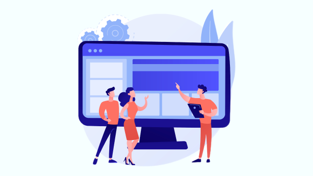
A good layout helps visitors understand the page in seconds:
- Put the key message first. The offer and the main CTA should be visible without scrolling, on a phone as well as a computer;
- Pass the five-second test. Show the page to someone for five seconds; if they cannot say what you offer, simplify the headline;
- Use white space. Space around text and buttons keeps attention on what matters;
- Write for scanning. Short paragraphs, subheadings and bullet points are easier to read than long blocks of text;
- Follow reading patterns. Many people scan a page in an F shape, along the top and down the left side, so put the most important points there.
Many visitors arrive on a phone, especially from social media, so design for small screens first. Our article on responsive web design explains how a page adapts to different screens.
Landing Page Colours
Use your brand colours on the landing page, so visitors recognise your business and trust the page. To make the CTA button stand out, give it a contrasting colour: if your brand is mostly green, a purple or orange button will catch the eye.
Make sure text is easy to read against its background. The WCAG accessibility guidelines recommend a contrast ratio of at least 4.5:1 for normal text and 3:1 for large text. Good contrast helps everyone, including people with low vision and anyone reading a phone in sunlight.
Landing Page Images
When you choose images for a landing page, ask yourself:
- Who is the audience? Think about their age, style and interests. People should recognise themselves or their situation in the image;
- Where should visitors look? Images can guide the eye. A person looking or pointing towards the form draws attention to it;
- Does it support the message? The image should show what visitors get: the product, the service in action or the result;
- Does it add value? Every element on the page should help the visitor decide. Real photos of your work, team or premises usually do this better than stock photos.
Compress images and use modern formats such as WebP, so they do not slow the page down.
Call to Action (CTA)
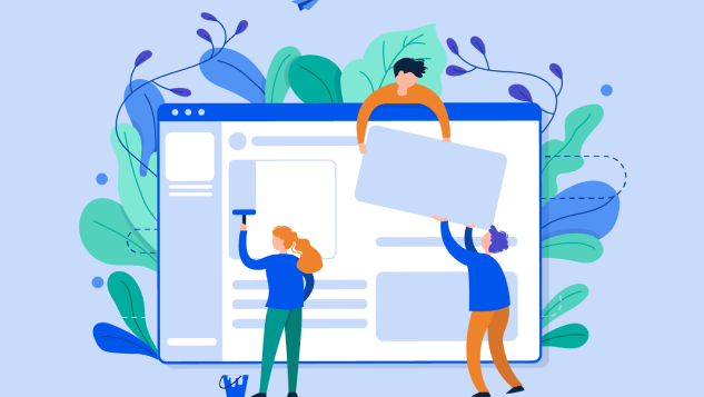
The call to action decides whether the landing page works. To make it clear and effective:
- Use a contrasting colour so the button is easy to spot;
- Focus on the benefit. Say what visitors get by clicking, for example “Get my free quote”;
- Keep it short. A few words are enough;
- Start with a verb such as “Get”, “Download”, “Book” or “Start”;
- Make the button big enough to notice and to tap easily with a thumb;
- Leave space around it, so nothing competes with the button;
- Place it where the eye goes: below or next to the text that explains the offer, and repeat it further down a long page;
- Test variations. Try different wording, colours and shapes with A/B testing to see what works for your audience.
A landing page needs visitors as well as a good CTA. Paid search ads are a quick way to bring them; our team can set up and run PPC campaigns that send traffic to your landing pages.
How to Optimise Your Landing Page
Launching the landing page is the start. Regular testing shows what to improve, and A/B testing, where two versions of the page are shown to different visitors, is the most reliable method. Start with the elements that matter most:
- Headline. It is the first thing visitors read, so try different versions;
- Main image. A different photo or a short video can change how long people stay;
- CTA. Test other wording and designs for the button.
Change one element at a time, so you know what made the difference. This is the core of conversion rate optimisation. A few landing page best practices to keep in mind:
- Keep improving the page. Review images, text and the form against your results;
- Make a strong offer. It should solve a real problem, show a clear benefit and stand out from competitors;
- Speed up the page. Slow pages lose visitors. Check the Core Web Vitals, Google’s measures of loading, responsiveness and visual stability, described on web.dev;
- Match the visitor’s stage. Someone just learning about the problem needs a guide or a checklist; someone ready to buy needs a quote or a booking;
- Keep the promise of the ad. The landing page should match the ad or email that brought the visitor. If the offer changes after the click, people lose trust;
- Guide the eye. Images, contrasting buttons, arrows, white space and bold colours or outlines lead visitors to the action.
If your landing page gets visitors but few enquiries, a website usability audit can show where people get stuck.