White space, also called negative space, is the empty area around and between the elements of a web page: the margins at the edges of the screen, the gaps between sections, the spacing between lines of text and the padding inside buttons and form fields. It does not have to be white. Any area left free of text and images counts, whatever its colour.
Empty space can look like wasted space to someone paying for a website. In practice it does a lot of work: it groups related things, separates unrelated ones, makes text easier to read and gives the important elements room to stand out.
Macro and micro white space
Designers usually split white space into two kinds.
- Macro white space is the large space between major blocks: around the header, between sections, between a photo and the text beside it, and the margins of the page.
- Micro white space is the small space inside blocks: between lines of text (line height), between letters and words, between a form label and its field, and inside a button around its text.
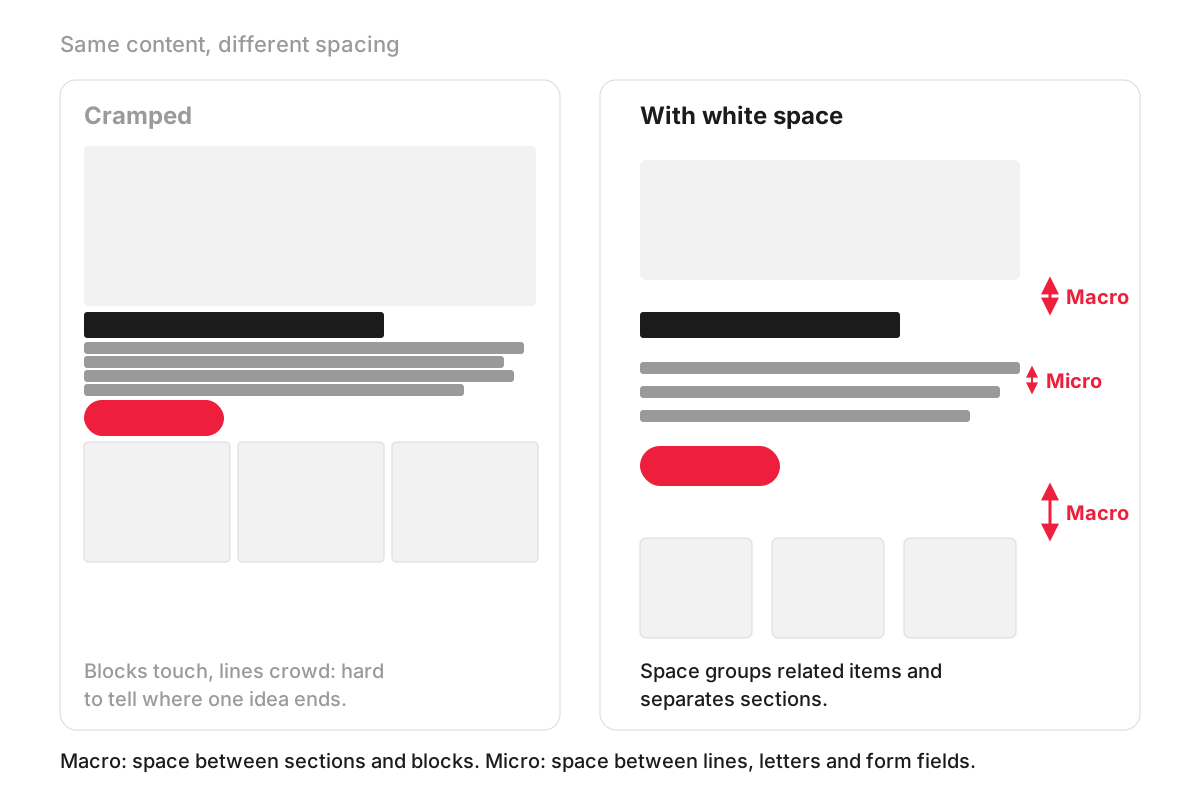
Both versions in the illustration hold exactly the same content. In the cramped one, the image, heading, paragraph, button and cards run into each other. In the spaced one, macro space separates the sections and micro space opens up the lines of text, so a visitor can see the structure at a glance.
What white space does for visitors
It groups and separates. People read items placed close together as related. Nielsen Norman Group calls this the law of proximity and notes that varying amounts of whitespace are how designers “unite or separate elements”. A price that sits closer to the wrong product, or a button closer to the wrong paragraph, causes real mistakes.
It makes text readable. Comfortable line height, space between paragraphs and a sensible line length make long text easier to follow. Accessibility rules go further: under WCAG success criterion 1.4.12 Text Spacing (Level AA), no content or functionality should be lost when a reader increases line height to 1.5 times the font size and the space after paragraphs to 2 times the font size, with similar minimums for letter and word spacing. The criterion does not dictate your design’s spacing; it requires that the page still works when people change it. More in our entry on web accessibility.
It points to what matters. An element surrounded by space draws the eye. That is why a main button with room around it is easier to find than one squeezed between links, and why space is one of the main tools of visual hierarchy.
It sets the tone. Generous space reads as calm and considered; tight, dense pages read as busy or cheap. Neither is wrong in itself, but the choice should match the brand and the audience.
An example: an accountancy firm’s services page
An accountancy firm lists eight services on one page, each with a paragraph of text, all in three narrow columns with little space between them. Visitors scroll past without finding the one they want.
The redesign keeps all eight services and the same words. Each service becomes a card with a short heading, two lines of description and a link to its own page. The cards have equal gaps between them, the section has space above and below it, and the line height of the body text is increased. Nothing has been deleted, yet the page now takes a few seconds to scan.
How much white space is too much?
White space has costs when it is overdone:
- A first screen with nothing on it. Large padding around a hero image on desktop can push the offer and the main button out of view. The first screen still has to carry the essentials; see above the fold.
- Desktop spacing on a phone. Margins that look elegant on a wide monitor take a third of a small screen. Spacing needs its own values for each screen size, which is part of responsive design.
- Lost connections. Items placed too far apart stop looking related, and options away from the visitor’s focus are easily missed.
- Pages that need density. A shop’s product listing or a price comparison table works better when visitors can see many items at once. On e-commerce category pages, too much space means more scrolling for the same choice.
A useful habit is a spacing scale: a short, fixed set of gaps (small, medium, large and so on) used everywhere on the site, usually tied to the same grid layout. It keeps similar sections spaced alike and stops every page from inventing its own gaps.
How we work with it
Spacing is decided early in our web design process: we make wireframes and clickable prototypes in Figma before design and development, so you can see how much room each section gets, on the screens that matter, before the visual design is added.
FAQ
Is white space the same as negative space?
Yes, in web and graphic design the two terms are used for the same thing: the empty area around and between elements. In art, “negative space” is also used for the shape formed by the empty area around a subject, which designers sometimes use for clever logos.
What does white-space: normal mean in CSS?
That is a different meaning of the same words. In CSS, the white-space property controls how a browser handles spaces and line breaks in the text itself. With the default value, normal, runs of spaces collapse into one, line breaks in the code are treated as ordinary spaces, and lines wrap to fit the box. It has nothing to do with the design sense of white space.
Does white space mean less content on the page?
No. Spacing changes how content is presented, not how much of it there is. Search engines read the text in the page’s code, so a well-spaced page can carry the same words as a cramped one; what changes is how easily people can read them. If a page feels long after adding space, the fix is usually better structure, such as clear headings and short summaries at the top of each section.
How do you check white space on a phone?
Open the page on a real phone and look at the first screen: the headline, offer and main button should be visible, and buttons should be far enough apart to tap without hitting the wrong one. Then zoom in or increase the text size in the phone’s settings and check that nothing overlaps or is cut off.