
A grid layout is a way of arranging a web page on an invisible framework of columns and rows, so that text, images and buttons line up along shared edges and keep consistent gaps between them. In web design the term covers two related things: the design grid a designer draws, often 12 columns on desktop, and CSS Grid, the browser feature developers use to build that structure in code.
Visitors never see the grid itself. They see its effect: blocks that line up, cards of equal width, margins that are the same on every page.
The parts of a grid
- Columns are the vertical strips content is placed on. A block “spans” a number of columns: a main text area might span 8 and a sidebar 4.
- Gutters are the fixed gaps between columns. They keep neighbouring blocks from touching and form part of the page’s white space.
- Margins are the space between the outermost columns and the edge of the screen.
- Rows set the vertical rhythm. Many web grids define only columns and let rows follow the content; a modular grid fixes both, which suits pages made of many cards.
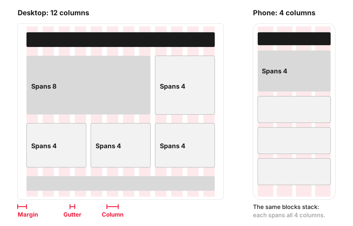
Twelve columns are popular because 12 divides evenly by 2, 3, 4 and 6. The same grid can hold two halves, three cards, four product tiles or an 8 and 4 split without anything falling off the grid. On a phone the grid usually drops to four columns, and most blocks span all of them, which is why content stacks into one column.
Grid frameworks: the 12-column standard
Many sites use a front-end framework that ships with a ready-made grid. Bootstrap, for example, describes its grid as a mobile-first twelve column system with six default responsive tiers. Developers assign each block a span per screen size:
<div class="row">
  <div class="col-12 col-lg-8">Main content</div>
  <div class="col-12 col-lg-4">Sidebar</div>
</div>
On small screens both blocks span all 12 columns and stack; from the large breakpoint up they sit side by side as 8 and 4.
CSS Grid: the grid built into browsers
Modern browsers also have a layout system of their own. MDN’s guide to CSS grid layout explains that, like tables, it lets authors align elements into columns and rows, with many more layouts possible. A three-column services section that becomes one column on a phone takes a few lines:
.services {
  display: grid;
  grid-template-columns: repeat(3, 1fr);
  gap: 24px;
}

@media (max-width: 640px) {
  .services { grid-template-columns: 1fr; }
}
CSS Grid works in two directions at once, rows and columns. Flexbox, the other main layout tool, arranges items along one line at a time, which suits menus, button groups and rows of icons. Most sites use both.
Why a grid matters for a business website
- Consistency. Pages built on the same grid share margins and column widths, so the site looks like one product even when different people add pages over the years.
- Quicker design and development. New pages reuse the same structure, and developers turn the grid into a small set of reusable classes or components.
- Responsive behaviour. A grid defines in advance what happens on each screen size, which is the backbone of responsive design.
- Easier editing. In a content management system, editors add blocks that drop into the grid, so a new section lines up without design work.
An example: a services page on a grid
An architectural practice wants a services page. On desktop, the introduction spans 8 columns and a contact box with a phone number spans 4 beside it. Below, six project cards sit in rows of three, each spanning 4 columns. On a tablet the cards switch to two per row, spanning 6 each, and the contact box moves under the introduction. On a phone everything spans the full width, with the contact box placed straight after the introduction, so the phone number appears early.
Common grid mistakes
- Breaking the grid by accident. Blocks a few pixels off the column edges look careless.
- Designing only the desktop grid. If nobody decides how blocks rearrange on smaller screens, developers have to guess.
- Equal boxes everywhere. A grid gives order, but a page made only of identical boxes has no focus. Deliberately letting one element span more columns creates a focal point; that is a question of composition.
- Card text of uneven length. When titles wrap to different numbers of lines, buttons inside cards end up at different heights. The grid and the card design need to be tested with real titles and descriptions.
How we work with it
The column structure of each page template is agreed early in our web development projects, because we make wireframes and clickable prototypes in Figma before design and development. Developers then build the same structure in code, so the agreed layout and the finished site match.
FAQ
How do you make a grid layout?
Designers set up a layout grid in their design tool, with the number of columns, the gutter and the margin for each screen size, and place every element on it. Developers then build the grid with CSS Grid, flexbox or a framework’s grid classes. It is worth agreeing the column counts and breakpoints between design and development at the start, so the finished pages match the wireframes.
How many columns should a website grid have?
There is no fixed rule. Twelve columns on desktop is a common choice because it divides in so many ways; tablets often use eight and phones four. Simple sites, such as a one-page portfolio, can work well on fewer columns.
Is CSS Grid supported by all browsers?
Yes, in all current major browsers. MDN marks the grid property as widely available and notes it has worked across browsers since October 2017. Only very old browsers lack support.
What is the difference between a grid layout and a website layout?
A website layout is the overall arrangement of a page: header, content, sidebar, footer and the blocks within them. A grid is the measuring system underneath that keeps those blocks aligned and sized consistently. You can describe a layout without mentioning its grid, but a layout built on a grid is easier to keep consistent across pages and screen sizes.