In web design, composition is the way the parts of a page, such as headings, text, images, buttons and empty space, are arranged so that they read as one whole, with a clear starting point and a natural path from one element to the next. A well-composed page feels settled: nothing looks accidental, and the eye knows where to land.
The word comes from painting and photography, and the principles are the same ones artists use. On this page we mean the web design sense: how a screen of a website is put together.
The elements of composition on a web page
Designers judge a composition by a few qualities. None of them is a rule on its own; they are checked together.
- Focal point. Each screen needs one element that clearly dominates: a strong headline, a product photo, a person’s face. Two or three elements fighting for that role make the page feel busy.
- Balance. Visual weight is spread so the page does not feel lopsided. Nielsen Norman Group’s principles of visual design describe symmetrical balance, where elements are mirrored around a central axis, and asymmetrical balance, where different elements offset each other, such as a large image on one side and a block of text with a button on the other. A third kind, radial balance, arranges elements around a central point and is rare on web pages.
- Alignment. Elements share edges. Text, images and buttons that start on the same invisible line look deliberate, which is why most sites are built on a grid layout.
- Proximity and space. Related items sit close together and unrelated ones further apart. White space is a working part of the composition in its own right.
- Contrast and scale. Differences in size, colour and weight separate what matters from what supports it.
- Rhythm. Repeated spacing and repeated components, such as cards of the same shape, give a long page a steady beat that makes it easier to scan.
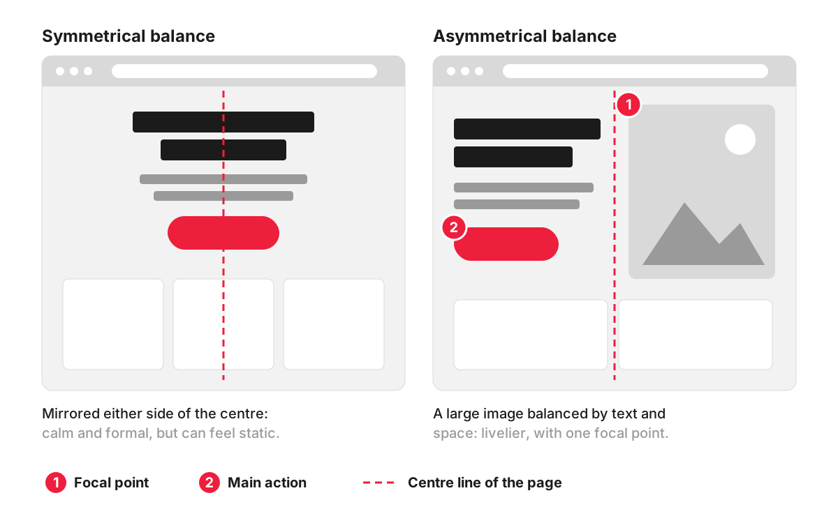
Symmetrical compositions feel calm and formal and suit short, single-message pages. Asymmetrical ones feel livelier and give one element, often a photo, the role of focal point, while the text and button on the other side hold the balance.
Composition, layout and visual hierarchy
These three terms overlap, and people often use them as synonyms. They describe different decisions:
- Layout is the structure: which areas the page has (header, content, sidebar, footer) and which block goes where. More in our entry on website layout.
- Visual hierarchy is the order of importance: what is seen first, second and third. See visual hierarchy.
- Composition is how all of it is arranged within each screen so it works as a whole: what balances what, what lines up, where the eye starts and how it moves on.
A page can have a sensible layout and a correct hierarchy and still look awkward, because the image is slightly too large for the text beside it or the button floats away from the paragraph it belongs to. That is a composition problem.
An example: composing the top of a clinic’s homepage
A physiotherapy clinic has a photo of a treatment room, a headline, a line about the conditions it treats and a “Book an assessment” button.
In the first draft, the photo fills the whole width with the headline centred on top of it. The photo is busy, so the white text is hard to read, and the eye bounces between the image and the words.
The reworked version is asymmetrical. The photo sits on the right and takes roughly half the width; the headline, the line of text and the button sit on the left, aligned to the same edge. The photo is the focal point, the button is the strongest element on the text side, and the space between the two halves keeps them from crowding each other. On a phone, the same blocks stack: headline and button first, photo below, so the main action stays on the first screen.
Why composition matters to a business
Composition affects how a site is judged before a word is read. A page with a clear focal point and tidy alignment looks cared for, and that carries over to how people judge the business behind it. It also affects what visitors do: a button placed close to the text that explains it, with space around it, is easier to see and easier to trust than one squeezed into a corner.
There is a practical side as well. A composition built from a small set of repeated components can be reused across many pages, which makes new pages quicker to design and build, and keeps the site consistent as it grows.
Common composition problems
- No focal point: a slider of several images, a video and a headline all competing on the first screen.
- Near misses in alignment: elements a few pixels off the shared edge look careless, even if visitors cannot say why.
- Uneven spacing: different gaps between similar sections make the page feel unplanned.
- Text over busy photos, where neither the image nor the words can be read properly.
- A desktop-only composition: an asymmetrical layout that stacks badly on a phone, pushing the headline or the button below the first screen.
How we work with it
Composition is settled in the design stages of our web design work. We make wireframes and clickable prototypes in Figma before design and development, so you can review how each page is put together, and ask for changes, before any code is written.
FAQ
What is visual weight in design?
Visual weight is how strongly an element pulls the eye compared with what is around it. Large, dark, high-contrast or brightly coloured elements weigh more, and so do photos of faces and elements isolated by empty space. A composition is balanced by setting one heavy element against several lighter ones, or against generous space.
What is the rule of thirds in web design?
The rule of thirds, borrowed from photography, divides a frame into a three-by-three grid and places the main subject on one of the lines or where they cross. On websites it is most useful for hero images and banners: placing the subject off-centre leaves room for a headline and helps when the image is cropped differently on a phone.
What are the elements of composition?
In art, the elements usually listed are line, shape, form, colour, value, texture and space. A web page uses the same raw material in the form of type, images, colour, icons, buttons and empty space, and composition is how those pieces are arranged.
Does a better composition increase conversions?
It can, because composition decides whether the main action is noticed and whether the page feels trustworthy. The only way to know for a specific page is to measure: compare enquiries or clicks before and after a change, or run an A/B test when the page has enough traffic.