Above the fold is the part of a web page that is visible as soon as it loads, before the visitor scrolls. Everything further down is below the fold. Because screens differ in size, the fold sits in a different place on a phone, a laptop and a large monitor, so above the fold content means whatever fits on the first screen of the device in someone’s hand.
Where the fold sits on a phone and on a laptop
The name comes from broadsheet newspapers, where only the top half of the folded front page was on show at the news-stand. A newspaper has one fold. A website has as many as there are screens.
On a laptop, the first screen is wide and fairly short: typically the header, a headline, a line of supporting text, a button and perhaps the top of the next section. On a phone held upright, a responsive page rearranges into a narrow, tall column, but less of it fits than you might expect. The browser’s address bar and your site header both take a share of the screen, and what remains may hold only the headline and one button. Large desktop monitors show more again, and visitors who enlarge text or zoom in see less.
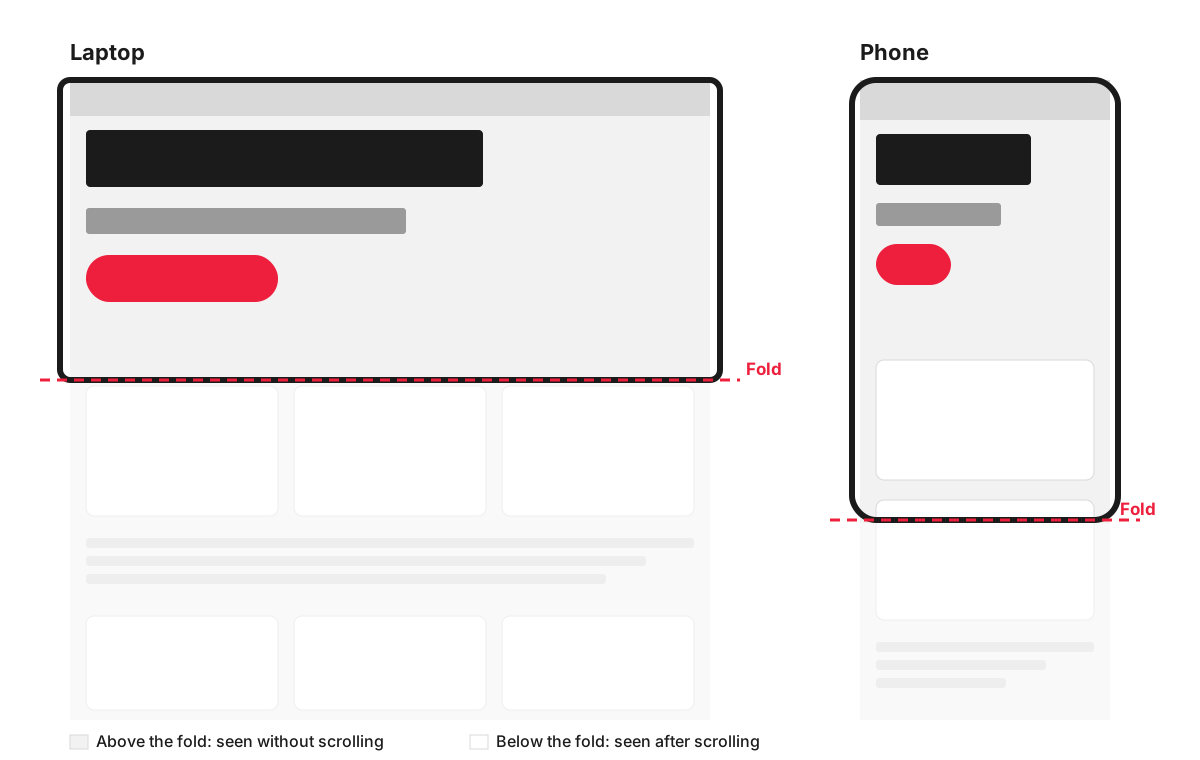
So there is no single line to design to. The practical approach is to decide what the first screen must say, then check it on a real phone and a real laptop, or in the device preview built into most browsers’ developer tools.
Does the first screen still matter if people scroll?
People do scroll. What changes is how much attention they give each part of the page. In an eyetracking study published in 2018, Nielsen Norman Group found that visitors spent about 57% of their viewing time above the fold and 74% within the first two screenfuls. That share had dropped from 80% above the fold in their 2010 study, probably because long pages had become the norm, but the pattern held: attention falls sharply once people pass the first screen.
The first screen therefore decides whether the rest of the page gets read. Its job is to confirm that the visitor is in the right place and give them a reason to keep going. Trying to fit everything into it usually backfires, because a crowded first screen answers nothing clearly.
One trap is a design that looks finished at the bottom of the first screen: a full-height banner with a hard edge and nothing peeking out beneath it. Nielsen Norman Group calls this an “illusion of completeness”, and it can make people think there is nothing more to see. Letting the top of the next section show is a simple signal that the page continues.
What the first screen of a service business site should answer
Picture a family solicitor in Reading, a boiler engineer in Witney or a physiotherapy practice in Bath. A new visitor arriving from Google has four questions, and the first screen should answer them in this order:
- What do you do, and where? A headline that names the service and the area, such as “Boiler repairs and servicing across West Oxfordshire”. A slogan like “Your comfort, our priority” could belong to any business.
- Is this for someone like me? One supporting line on who the service is for or what makes it different, provided it is true and specific.
- Can I trust you? A short proof point: a review rating with its source, a membership or accreditation that matters in your trade.
- What do I do next? One clear main button, such as “Get a quote” or “Book an appointment”. On a phone, a tap-to-call number is often the action people want.
A photo of your real team, premises or work does more here than a stock image, because it is one more piece of evidence that you are who you say you are.
Things that tend to waste the first screen:
- An auto-rotating slider, which splits the space between several messages while visitors only see the one showing when they arrive.
- A background video that delays loading and pushes the message aside.
- A welcome paragraph about the company’s history.
- Three or four buttons of equal weight, which leave people unsure which one matters.
- A cookie banner that covers most of the screen on a phone.
On a landing page reached from an ad, add one more rule: the first screen should repeat the promise of the ad that brought the visitor there.
What goes below the fold
Below the fold is where interested visitors look for detail, and a long page is fine when each section answers the next question they have. Here is how the sports injury page of a physiotherapy practice might split on a phone:
- Above the fold: the practice name and a call button in the header, the headline “Sports injury physiotherapy in Bath”, one line such as “Assessment and treatment plans for runners, cyclists and club players”, a review rating with its source and a “Book an assessment” button.
- Below the fold: what happens at the first appointment, prices and session length, the physiotherapists and their qualifications, the injuries they treat, reviews in full, parking and opening hours, answers to common questions and the booking form.
Clear headings and a consistent visual hierarchy help people scan down to the part they need.
Seeing the first screen before it is built
On our website design projects, the first screen is agreed in wireframes and designs before development starts, so you can open it on your own phone and laptop and judge it while changes are still quick.
FAQ
Does above the fold matter for SEO?
Indirectly. Google’s Core Web Vitals include Largest Contentful Paint, which measures how quickly the largest element in the first screen appears; Google’s web.dev guidance on LCP treats 2.5 seconds or less as good. A heavy banner image or video above the fold is a common reason that score suffers. Google also announced in 2012 that pages making visitors scroll past a large block of ads to reach the content could rank lower.
Is “above the fold” the same as the hero section?
Not quite. The hero section is a design element, usually the large banner at the top of a page. Above the fold is whatever is visible before scrolling, which on a laptop may include the hero and part of the next section, and on a phone may be only part of the hero.
What does “above the fold” mean in email?
It is the part of an email the reader sees on opening it, before scrolling. On a phone that area is small, so the main message and the main link or button belong at the top. A tall header image or logo banner can push both out of view.
How many pixels is above the fold?
There is no fixed number. The fold depends on the screen size, the browser, its toolbars and the zoom level, so the same page has a different fold on every device. Your analytics can show which screen sizes your visitors actually use, which is a better guide than any rule of thumb.