
Responsive design is an approach to building websites in which one page, with one address and one set of content, adapts its layout to the screen it is viewed on. On a wide monitor the content might sit in three columns with a full menu; on a phone the same content stacks into a single column, the menu folds behind an icon and images shrink to fit.
MDN, the reference documentation for web developers, defines responsive web design as an approach “to make web pages render well on all screen sizes and resolutions while ensuring good usability”. The term was coined by Ethan Marcotte in 2010, and it is now the normal way to build a website.
How responsive design works
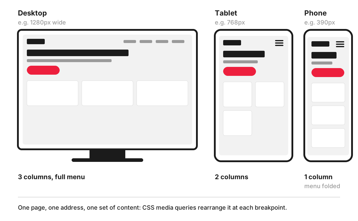
Four techniques do most of the work:
- The viewport tag. A line in the page’s head tells mobile browsers to use the device’s real width. Without it, phones render the page as if on a wide desktop screen and shrink it down. MDN’s reference for the viewport meta tag recommends
<meta name="viewport" content="width=device-width">. - Flexible grids. Columns are sized in proportions, so they stretch and shrink with the window. Most sites use a grid layout with fewer columns on smaller screens.
- Flexible images. Images are limited to the width of their container, and the browser can be offered several sizes of the same image so a phone does not download a desktop-sized file.
- Media queries. CSS media queries apply different styles depending on features such as the width of the browser window. The widths at which the layout changes are called breakpoints.
A common pattern is mobile-first: the base styles describe the phone layout, and media queries add columns as the screen gets wider.
.cards { display: grid; grid-template-columns: 1fr; gap: 16px; }

@media (min-width: 768px) {
  .cards { grid-template-columns: repeat(2, 1fr); }
}

@media (min-width: 1200px) {
  .cards { grid-template-columns: repeat(3, 1fr); }
}
Responsive and adaptive design: the difference
Adaptive design prepares a small number of fixed layouts for set screen widths and shows the one that fits; some adaptive sites even send different HTML to phones and desktops. Responsive design uses one flexible layout that changes smoothly, with breakpoints where it rearranges. In practice, most modern sites are responsive, with an adaptive touch here and there, such as a different image crop on phones.
Separate mobile sites on their own address, such as m.example.co.uk, were common before responsive design took over. They mean two versions of every page to maintain and keep in step.
Why responsive design matters for a business
- Search. Google uses the mobile version of a site’s content for indexing and ranking, which it calls mobile-first indexing, and states that it recommends responsive web design because it is the easiest design pattern to implement and maintain. With one responsive page, there is only one version of the content for Google to index.
- One site to maintain. Every price change or new page is made once and appears correctly on every device.
- Accessibility. WCAG success criterion 1.4.10 Reflow (Level AA) asks that content can be read without scrolling in two directions at a width equivalent to 320 CSS pixels, which is what a 1280-pixel window shows at 400% zoom, with an exception for content that needs a two-dimensional layout to be used or understood. A well-built responsive layout meets much of this by design. More in web accessibility.
- Enquiries. If the phone number, the form or the booking button is hard to use on a phone, visitors on phones go elsewhere.
What “fully responsive” means in practice
Agencies and themes often promise a “fully responsive” site. A reasonable test of that promise is whether, on every page type and every common screen size:
- nothing scrolls sideways, including tables, embedded maps and videos;
- text can be read without zooming, and zooming still works;
- buttons and links are big enough and far enough apart to tap accurately;
- forms are easy to fill in, with the right phone keyboard for email and phone fields;
- the menu opens and closes easily, and key actions stay visible (see website navigation);
- the first screen on a phone still shows the offer and the main action, as covered under above the fold;
- images are sized for the screen, so pages load quickly on mobile data.
Test on real phones and tablets as well as the device mode in browser developer tools, and in more than one browser, because layouts can differ between them. That is the subject of cross-browser rendering.
Common responsive design problems
- A desktop design squeezed onto a phone, with the same large margins, headings that wrap onto five lines and a sidebar that drops to the bottom with the contact details in it.
- Content hidden on phones to save space, so mobile visitors and Google see less than desktop visitors.
- Elements with fixed widths, such as wide tables or embedded widgets, that break the layout.
- Breakpoints chosen for specific devices, which date quickly. Breakpoints work better where the content itself starts to look cramped.
- Pinch zoom switched off in the viewport tag, which makes the site harder to use for people with low vision.
How we work with it
For a new site or a rebuild, our web development process starts with a short Discovery stage, after which we confirm the final price with a line-item estimate. Wireframes and clickable prototypes are made in Figma before design and development, so you can check how the key pages are laid out before any code is written.
FAQ
What are the common breakpoints in responsive design?
There is no official set. Frameworks pick their own: Bootstrap, for example, uses six default tiers starting at 576, 768, 992, 1200 and 1400 pixels, plus a base for the smallest screens. Many designers start from those values and add or move breakpoints where their own content needs them.
Is responsive design the same as a mobile-friendly website?
They overlap but are not identical. Mobile-friendly describes the result: a site that is easy to use on a phone. Responsive design is one way of getting there, using one page that adapts to every screen. A separate mobile site can also be mobile-friendly, but it means maintaining two versions.
How can I check if my website is responsive?
Open it on your phone and on a laptop, then make the browser window narrower and wider and watch whether the layout rearranges smoothly. Browser developer tools have a device mode that simulates common screen sizes. Check the pages that matter most, such as the homepage, a service or product page and the contact form, and look out for sideways scrolling, tiny text and buttons that are hard to tap.
Can an older website be made responsive?
Sometimes. If the site runs on a content management system with a reasonably modern theme, the templates can often be reworked. Very old sites built with fixed widths or table layouts usually need their templates rebuilt, and at that point it is worth reviewing the structure and content too. Our article on why and when responsive web design is used gives more background.