
Cross-browser testing is the practice of checking that a website displays correctly and works properly in the different browsers and devices its visitors use, such as Chrome, Safari, Edge and Firefox on phones, tablets and computers. Each browser renders, or draws, the same code in its own way, so a page that looks perfect on the designer’s laptop can have a broken menu on an iPhone or a form that will not submit in another browser.
MDN’s introduction to cross-browser testing defines it as making sure a website works across various browsers and devices. You may also see it called cross-browser compatibility testing, and the differences it catches called cross-browser rendering issues.
Why the same page looks different in different browsers
Browsers follow the same web standards, but they are built by different companies on different engines, and they do not all add new features at the same time. MDN names three usual causes:
- Bugs and different implementations. Browsers sometimes interpret the same code slightly differently, which shows up as shifted spacing, different font sizes or a misaligned button.
- Uneven feature support. A newer layout technique, image format or form control may work in one browser and be missing or partial in another. The Baseline project, explained on web.dev, tracks this: a feature becomes “newly available” once all core browsers support it and “widely available” 30 months later.
- Devices. Screen size, touch input and processing power change how a page behaves, which is where cross-browser testing meets responsive design.
MDN also counts people who use a screen reader or only a keyboard among the visitors to test for, so web accessibility checks belong in the same round of testing.
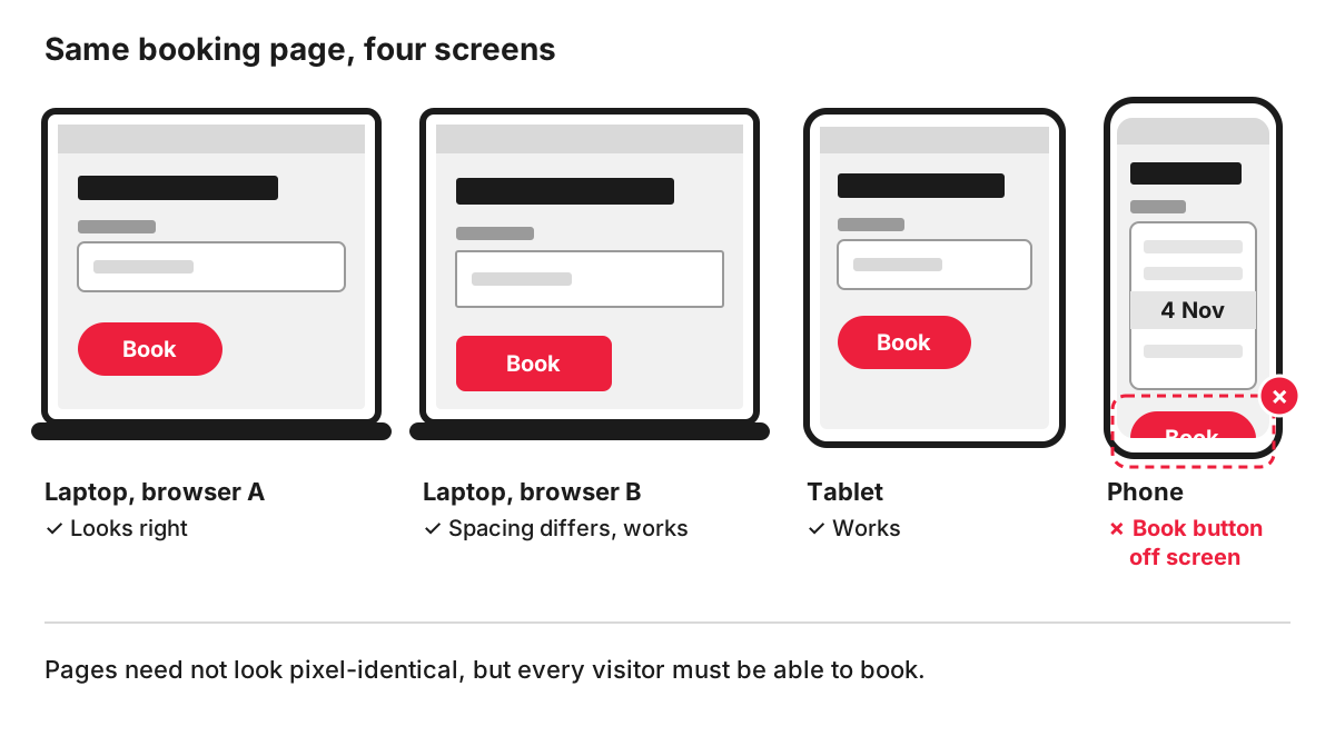
A typical example: a dental practice adds an online booking form with a date picker. It works in Chrome on the office PC. On an iPhone, the date field shows a different control, the “Book” button slips below the screen edge, and some patients give up. Nobody notices, because nobody at the practice books on an iPhone.
Which browsers to test in the UK
Start from the browsers your visitors actually use. Your analytics shows this for your own site; for the UK as a whole, StatCounter’s browser figures for September 2026 put Chrome at 49.86%, Safari at 29.85%, Edge at 12%, Samsung Internet at 3.82% and Firefox at 1.89% across all devices. In the same month, StatCounter recorded 53.39% of UK web traffic on mobile, 41.96% on desktop and 4.65% on tablet.
In practice, a sensible list for most UK business sites is Chrome and Edge on Windows, Safari on a Mac, Safari on an iPhone, Chrome on an Android phone and, where your analytics show it, Samsung Internet and Firefox. Internet Explorer can be left out: Microsoft ended support for the Internet Explorer 11 desktop application on certain versions of Windows 10 on 15 June 2022 and points users to Edge.
What gets checked
Testing concentrates on what visitors need to do, page by page:
- layout at each screen width, with nothing overlapping or cut off;
- menus, pop-ups, sliders and the cookie banner;
- forms, from typing and validation to the confirmation message;
- the basket and checkout, payment pages and login;
- fonts, images, video and maps loading as they should;
- keyboard navigation and visible focus.
A site does not have to look pixel-identical everywhere. MDN puts it well: the core functionality must be available in some way, so an older browser might show a flat image where a modern one shows an animation. What matters is that every visitor can read the content and take the next step, which is a question of user experience as much as of code.
How cross-browser testing is done
MDN describes a cycle of planning, development, testing and fixes, repeated until the agreed browsers pass. Teams usually combine:
- Browser developer tools, including device emulation, for fast checks while building.
- Real phones and computers, at least one iPhone and one Android phone, because emulators miss touch behaviour and some rendering details.
- Cloud testing services that open the site in many browser and device combinations, useful for versions nobody has to hand.
- Automated tests for key journeys such as checkout, run on every release so a fix for one browser does not break another.
How we test
On our website development projects, every page is tested across browsers and devices, checked for accessibility and security, and optimised for loading speed, and you receive a test report together with the completed fixes. If you are planning a new build, our web development page sets out the stages from Discovery to launch.
FAQ
What is the best tool for cross-browser testing?
There is no single best tool. Developer tools built into Chrome, Safari, Edge and Firefox cover quick checks; cloud services that run real browsers remotely cover the wide range; real devices remain the final check for touch and performance. Automated testing frameworks such as Selenium, which MDN mentions, suit larger sites with journeys that need retesting after every release.
Why does my website look different on an iPhone?
Safari on iOS handles some fonts, form fields, video and fixed elements differently from Chrome on a computer, and the small screen changes the layout. If a page was only checked on a desktop browser, these differences go unnoticed until a customer reports them.
Is cross-browser testing the same as responsive design testing?
They overlap. Responsive testing checks how the layout adapts to different screen sizes. Cross-browser testing checks that the site works in different browsers, which includes the same screen size in Chrome and Safari. A full round covers both, plus basic accessibility checks.
How often should a website be tested across browsers?
Before launch, after any significant change to templates, menus, forms or checkout, and after major browser updates if your site relies on newer features. For an online shop, a quick check of the checkout on the main browsers after each release is a good habit. Our guide on how to test a website covers other kinds of testing too.