
User interface (UI) design is the design of everything a visitor sees and touches on a website or app: the layout, typography, colours, buttons, forms and icons, and the way each of them responds when it is tapped, clicked or filled in. Good UI design makes the next step obvious and keeps every page looking and behaving as part of the same site.
What a website interface is made of
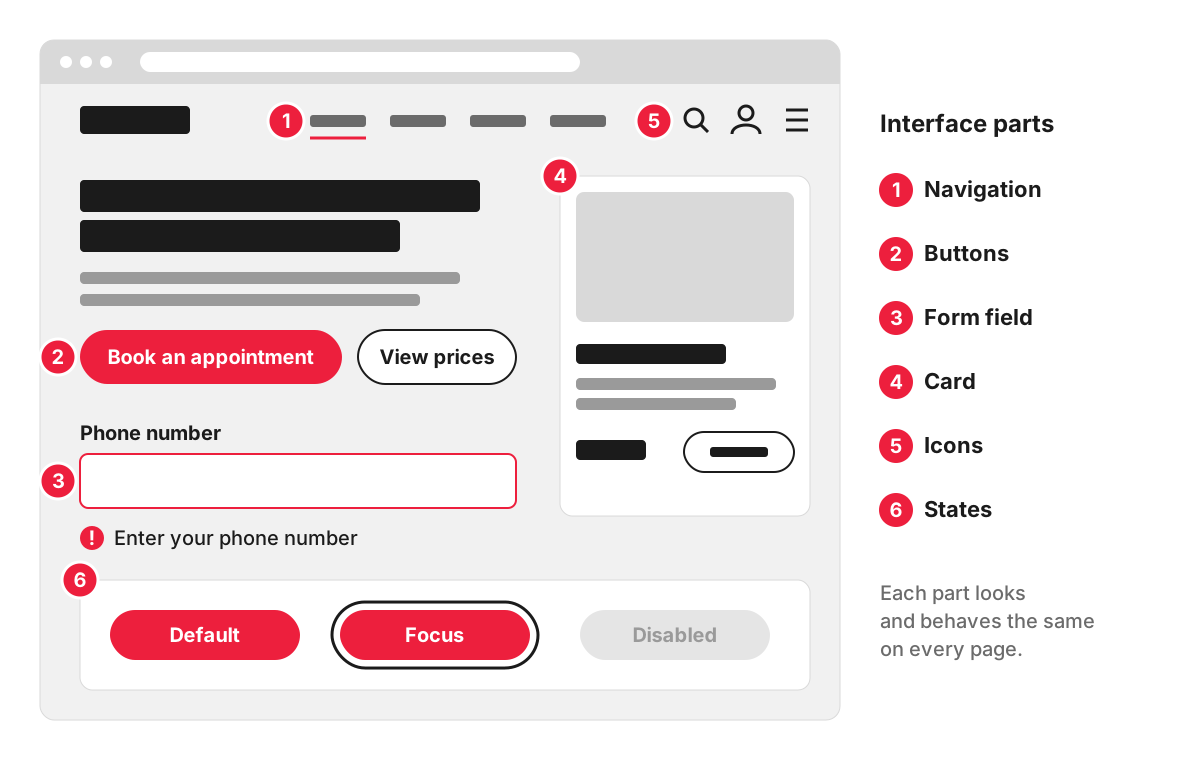
When an agency sends you designs to approve, these are the parts you are looking at:
- Layout. Where content sits on the page, how much white space surrounds it, how wide the columns are and how they stack on a phone.
- Typography. The typefaces, text sizes, line spacing and line length. Heading sizes show which information matters most, which is the idea behind visual hierarchy.
- Colour. Brand colours, plus colours that do a job: links, the main button, error messages, confirmations.
- Buttons and links. What is clickable, and which action on the page is the primary one.
- Forms. Field labels, the order of questions, error messages and what appears after someone presses Send.
- Icons and images. Whether they explain something or only decorate.
- States. Every interactive element has several looks: default, hover, keyboard focus, pressed, disabled, loading and error.
States are easy to leave out of design files. If the designs only show buttons and fields in their default look, developers have to guess the rest, and different guesses on different pages make the site feel patched together.
Take the booking page of a hair salon. UI decisions there include whether “Book an appointment” is a solid button that clearly outranks “View prices”, whether the date picker works comfortably with a thumb, and what a client sees if they forget to fill in their phone number.
UI vs UX: where one stops and the other starts
UX (user experience) design shapes the journey: what visitors need, which pages exist, what order they come in and how many steps it takes to get in touch. UI design shapes the surface of that journey: how each screen looks and how each element behaves.
A driving school’s website shows the split well. Deciding that every course page needs a short “Request a callback” form asking only for name, phone number and postcode is a UX decision. The size and colour of the button, the wording of the labels, the message that appears when a postcode is mistyped and the confirmation after sending are UI decisions.
- UX asks: Can people find what they came for? Does the journey make sense? Where do they give up?
- UI asks: Is it clear what to click? Is the text easy to read? Does every element respond the way people expect?
Each depends on the other. A polished interface cannot save a journey that sends people round in circles, and a well-planned journey still loses people if the main button looks like a caption. On small and medium projects one designer often handles both; larger teams split them into separate roles. In the project timeline, wireframes mostly settle UX questions and the visual design settles UI.
Why every page should follow the same rules
Visitors learn an interface on the first page they see. If “Get a quote” is a green button on one page and a plain text link on the next, people hesitate, and hesitation on a contact page costs enquiries.
Consistency comes from a design system: a library of components (buttons, cards, form fields, page sections) with rules for when and how each is used. It also makes a site cheaper to grow, because a new page is assembled from parts that already exist and already match.
What to check before you approve a design
Design approval is often the last cheap moment to change something. A short checklist:
- The main action. On each page, can you tell within a few seconds what you are being asked to do? There should be one obvious primary button style.
- The phone version. A responsive site changes its layout on smaller screens, so ask to see mobile layouts as well as desktop, especially for the home page, a service page and the contact form.
- Real content. Placeholder text and stock photos hide problems. Check designs with your actual headings, your longest service name and your real photos.
- States and messages. Ask what a form looks like with an error, what a button looks like when it has keyboard focus, and what a page shows when a list is empty.
- Readability. Body text large enough to read on a phone without zooming, and enough contrast against its background.
- Form labels. Labels should stay visible above the fields. Placeholder text inside a field disappears as soon as someone starts typing.
- Repeated elements. The same component should look the same on every page you are shown.
How interface choices affect accessibility
Many of the barriers disabled visitors meet are UI decisions. The Web Content Accessibility Guidelines (WCAG) 2.2, published by the W3C, set these minimums at level AA: a contrast ratio of at least 4.5:1 for normal text and 3:1 for large text, a visible keyboard focus indicator, and a target size of at least 24 by 24 CSS pixels for clickable elements, with some exceptions such as links inside a sentence. Colour should never be the only signal: an error shown only by a red outline is missed by people who cannot tell red from other colours, so it needs a written message as well. The wider picture, including UK rules, is on our web accessibility page.
Interfaces on our website projects
As part of our web design services, you see and comment on the interface before development starts. The corporate websites we build work the way a design system does: they are made of reusable blocks, with templates for services, case studies and articles.
FAQ
Is UI design the same as web design?
Web design is the wider job. It covers the structure of a site, the journey through it, the content on each page and the look of every screen. UI design is the part that deals with the interface itself: the components, how they look and how they respond to a tap, a click or a mistake.
What is the difference between UI design and graphic design?
Graphic design produces visuals people look at: logos, brochures, social media posts, packaging. UI design produces things people operate, so every element also needs behaviour for hover, focus, errors and small screens. A brand’s graphic design is usually the starting point: its colours, typefaces and logo carry over into the buttons, forms and page components of the website.
What tools are used for UI design?
Most interface work is done in dedicated design tools such as Figma, where designers draw screens, build reusable components and link screens into clickable prototypes that clients can try and comment on. We prepare wireframes and clickable prototypes in Figma, so you can review the interface in the same place it is designed.
Can I learn UI design on my own?
Yes. Free guides cover the basics well: Google’s Material Design and Apple’s Human Interface Guidelines explain how common components should look and behave. For a business owner, knowing these basics makes it easier to judge designs and give clear feedback; designing a full interface for a business website is usually work for a designer.