Website navigation is the system of menus, links and signposts that lets visitors move between the pages of a site and understand where they are in it. It includes the main menu in the header, drop-down menus, breadcrumbs, search, buttons and links within the content, and the links in the footer.
Good navigation answers two questions on every page: where am I, and where can I go next? When it works, nobody notices it. When it does not, visitors leave, or phone to ask something the site already explains.
The main types of website navigation
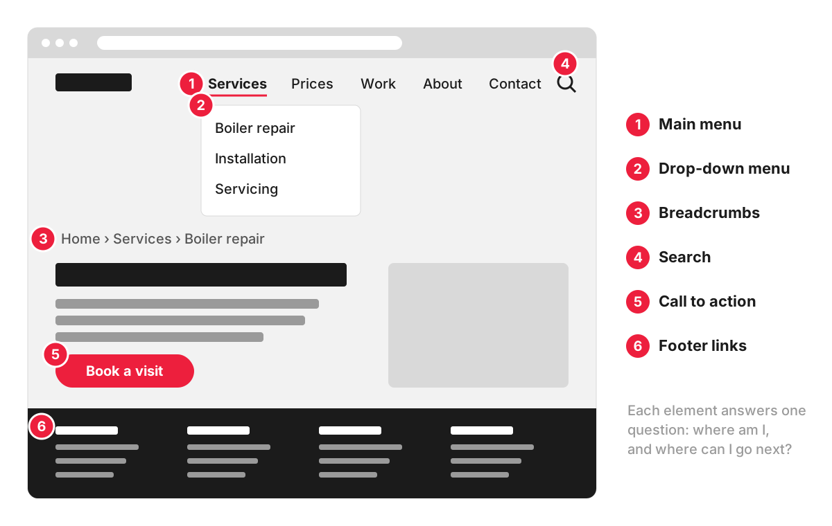
- Main menu. The links in the header to the main sections of the site, such as Services, Prices, Work, About and Contact. It appears on every page, so it is also called global navigation.
- Drop-down or mega menu. A panel that opens from a main menu item to show the pages beneath it. A mega menu is a large drop-down with many links in groups, common on shops with many categories.
- Breadcrumbs. A trail such as Home › Services › Boiler repair. Google describes it as a line that indicates the page’s position in the site hierarchy, and it can show breadcrumbs in search results when the page has the right structured data markup.
- Search. Essential for large sites and shops; less important for a ten-page service site.
- Calls to action and links in the content. The “Book a visit” button, links from one service to a related one, and links from articles to the services they mention. These are internal links, and they often do more for visitors than the menu does.
- Footer links. Contact details, legal pages, and often a fuller list of pages for visitors who reach the bottom.
Navigation on phones and the hamburger menu
On a phone, the main menu usually folds away behind an icon of three lines, the hamburger menu. It saves space, but hiding navigation has a cost. In a Nielsen Norman Group study, hidden navigation hurt the experience on both desktop and mobile, less so on mobile, and the authors conclude that the hamburger icon is not so universal that everyone knows to look for it.
Practical consequences for a business site:
- keep the one or two actions people need most, such as “Call” or “Book”, visible outside the folded menu;
- make the menu button large and easy to spot, ideally with the word “Menu” next to the icon;
- make sure the most important pages can also be reached from links within the content.
Why navigation matters to visitors and to search engines
For visitors, navigation is how they find the service, the prices and the contact page. The labels matter as much as the structure: “Boiler repair” is clearer than “Solutions”, and “Prices” is easier to find than “Investment”. Navigation is a large part of a site’s user experience.
For search engines, menus and links are how crawlers discover pages and judge which ones the site treats as important. Google states that it can only crawl your link if it’s an <a> HTML element with an href attribute. A menu built from clickable elements without real links may work for people and still leave pages hard for Google to find, which matters for SEO.
Accessible navigation
People who use a keyboard or a screen reader need navigation that works without a mouse. The WCAG standard asks for consistent navigation (success criterion 3.2.3, Level AA): menus repeated across pages should appear in the same relative order each time, unless the user changes them.
The web.dev guide to building the main navigation recommends a list of links wrapped in a <nav> element, the current page marked with aria-current="page", a real button with aria-expanded for a folding menu, and a menu that can be used and closed with the keyboard:
<nav aria-label="Main">
  <ul>
    <li><a href="/services/" aria-current="page">Services</a></li>
    <li><a href="/prices/">Prices</a></li>
    <li><a href="/contact/">Contact</a></li>
  </ul>
</nav>
More on the wider topic in our entry on web accessibility.
Common navigation problems
- Labels in company language that visitors do not search for or recognise.
- Too many top-level items, so nothing stands out. Grouping pages under a few clear headings helps.
- Drop-downs that open only on hover, which do not work on touch screens and are awkward with a keyboard.
- Important pages reachable only through search or the footer.
- Menus that change between sections, so visitors lose their bearings.
- Prices or contact details buried three clicks deep when they are what most visitors came for.
A simple test: ask two or three people outside the business to find a specific service, its price and how to book, using only the site. Watch where they hesitate.
How we work with it
Navigation problems are among the issues a UX audit looks for. We use session recordings and heatmaps where Microsoft Clarity or Hotjar is connected; otherwise our team tests the site itself. You receive screenshots of each problem with a recommendation. The UX audit starts from £530.
FAQ
What is the top navigation of a website called?
It is usually called the main menu, the header navigation, the navbar or global navigation. All of these mean the row of links at the top of every page that leads to the main sections of the site.
What is a mega menu?
A mega menu is a large drop-down panel that shows many links at once, grouped under headings and sometimes with images. It suits shops and large sites with many categories, where a short drop-down would hide most of the options. It needs care on phones and with keyboards, because a panel that opens on hover is hard to use without a mouse.
How many items should a website menu have?
There is no magic number. The main menu should cover the tasks most visitors come for, with labels they recognise, and nothing else. For a small service business that is often a handful of items; larger sites group pages under a few headings and use drop-downs or a mega menu for the rest.
What is the difference between navigation and site structure?
Site structure, also called information architecture, is how pages are organised and grouped: which sections exist and which pages sit under each. Navigation is how that structure is presented to visitors through menus, breadcrumbs and links. A clear structure makes navigation easy to design; a muddled one cannot be fixed by a better menu alone. It is also reflected in the layout of each page.