A website layout is the arrangement of the main parts of a web page: the header with the logo and menu, the main content area, any sidebar, and the footer, together with the order and size of the blocks inside them. It decides what a visitor sees first, where they look for the menu and how the page changes from a wide screen to a phone.
Some translated articles also use “layout” for the work of turning a finished design into HTML and CSS code, which English-speaking developers call front-end development. Our older article on site layout uses the word in that sense. This page is about the arrangement of the page itself.
The building blocks of a page layout
Most web pages are built from the same five areas. MDN’s guide to structuring documents lists them along with the HTML element for each:
- Header (
<header>): a strip across the top with the logo and often a phone number or a main button. - Navigation (
<nav>): links to the main sections of the site, usually in or near the header. See website navigation. - Main content (
<main>): the area that holds what is unique to this page. - Sidebar (
<aside>): related information next to the main content, such as contact details, categories or related links. - Footer (
<footer>): a strip at the bottom with contact details, legal links and secondary navigation.
Using these elements in the code matters beyond tidiness. Screen readers use them as landmarks, so a visitor can jump straight to the main content or the navigation, which is part of web accessibility.
Common website layout types
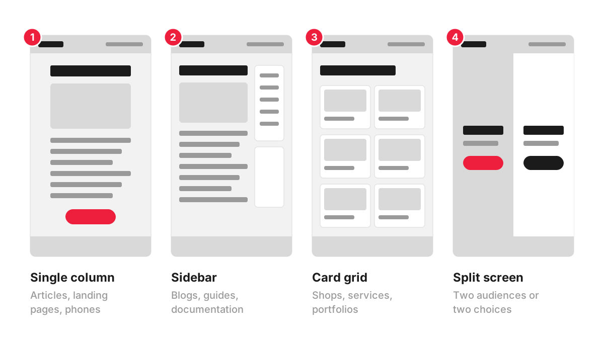
- Single column. One column of content from top to bottom. It is easy to read, works the same way on a phone and suits articles, landing pages and step-by-step content.
- Main column with a sidebar. The content takes about two thirds of the width and a sidebar holds supporting links or a contact box. Common on blogs, guides and documentation. On a phone the sidebar has to go somewhere, usually below the content.
- Card grid. Repeated cards in rows, each linking to a page: products, services, projects or articles. It relies on a consistent grid layout.
- Split screen. Two halves of equal weight, useful when a site serves two clear audiences or offers two choices, for example “I want to sell” and “I want to buy”.
Real pages mix these. A typical homepage stacks several full-width sections, each with its own internal layout: a split hero, a card grid of services, a single column of reviews.
How people scan a layout
Layout decisions follow how people look at a screen. Nielsen Norman Group’s eye-tracking research found that on text-heavy pages without strong cues, people often scan in an F-shaped pattern: across the top, across again a little lower, then down the left side. Their advice is to give readers cues: clear headings, key points early, and words that carry information at the start of lines and headings.
For a layout, that means the content people need most belongs near the top and on the left of each section, and long blocks of text should be broken up by headings that make sense when read on their own.
How to choose a layout for your pages
Start from the job each type of page has to do:
- Homepage: what you do, for whom, where, and the main next step, with routes to every main section.
- Service page: the service explained, prices or what they depend on, proof, answers to common questions and a clear way to enquire.
- Product listing: a card grid with filters, so people can compare many items quickly.
- Article or guide: a single readable column, sometimes with a contents list.
- Campaign page: one offer and one action, as on a landing page.
Then check each layout on a phone. Content in a desktop sidebar ends up below everything else on a small screen, so anything important, such as a phone number or a booking button, needs a place in the main column too. That is where layout meets responsive design.
Layout, wireframe and template
The layout of each page type is usually agreed as a wireframe: a plain grey drawing that fixes what goes where before colours and images. The approved layout becomes a page template in the site’s CMS, and every page of that type reuses it. A typical business site needs only a handful of templates: homepage, service page, article, contact page and perhaps a listing page.
Common layout mistakes
- Designing with placeholder text. Real headings are longer, real photos have different proportions, and the layout breaks when the actual content arrives.
- Different layouts for pages of the same type, so visitors have to relearn where things are on every page.
- Key messages in a carousel, where visitors often scroll past before the slide they need comes round.
- Too many columns of text, which make lines short and choppy on desktop and create very long pages on a phone.
How we work with it
Layouts are settled before visual design in our website design projects: we make wireframes and clickable prototypes in Figma, so you can click through the structure of the site before it is designed and built. For a single campaign page, landing page design starts from £450 for Basic Landing Page Design, which includes a wireframe, one page design concept and responsive layouts.
FAQ
What is the best layout for a website?
There is no single best layout. The right one depends on the page’s job, the amount of content and how people arrive at it. Most business sites combine a few types: stacked sections on the homepage, a single column for articles and a card grid for listings.
What is the difference between layout and design?
Layout is the arrangement: which blocks a page has, in what order and how much space each takes. Design covers that and everything that gives the page its look, such as colours, fonts, photography, icons and the style of buttons. Layout is usually decided first, because changing structure later means redrawing finished designs.
What is the difference between a fixed and a fluid layout?
A fixed layout has set widths in pixels and looks the same on every screen until the screen is too narrow, when it starts scrolling sideways. A fluid layout uses proportions, so columns stretch and shrink with the window. Modern sites combine fluid widths with breakpoints where the layout rearranges, which is responsive design.
What should be at the top of a website layout?
The header with the logo and navigation, and below it the first screen: a headline that says what you offer, a line on who it is for and the main action. Visitors decide in those first moments whether they are in the right place, which is why the content above the fold deserves the most care.