The parallax effect in web design is a scrolling effect in which the layers of a page move at different speeds: usually a background image moves more slowly than the text and images in front of it. Because near objects seem to move faster than distant ones, the difference in speed reads as depth, as if the page were built from layers at different distances.
The name comes from the real-world effect. Look out of a train window and the fence beside the track rushes past while the hills on the horizon barely move. Two-dimensional video games used the same trick for decades to make flat scenery look deep, and websites borrowed it, which is why it is also called parallax scrolling.
How the parallax effect works
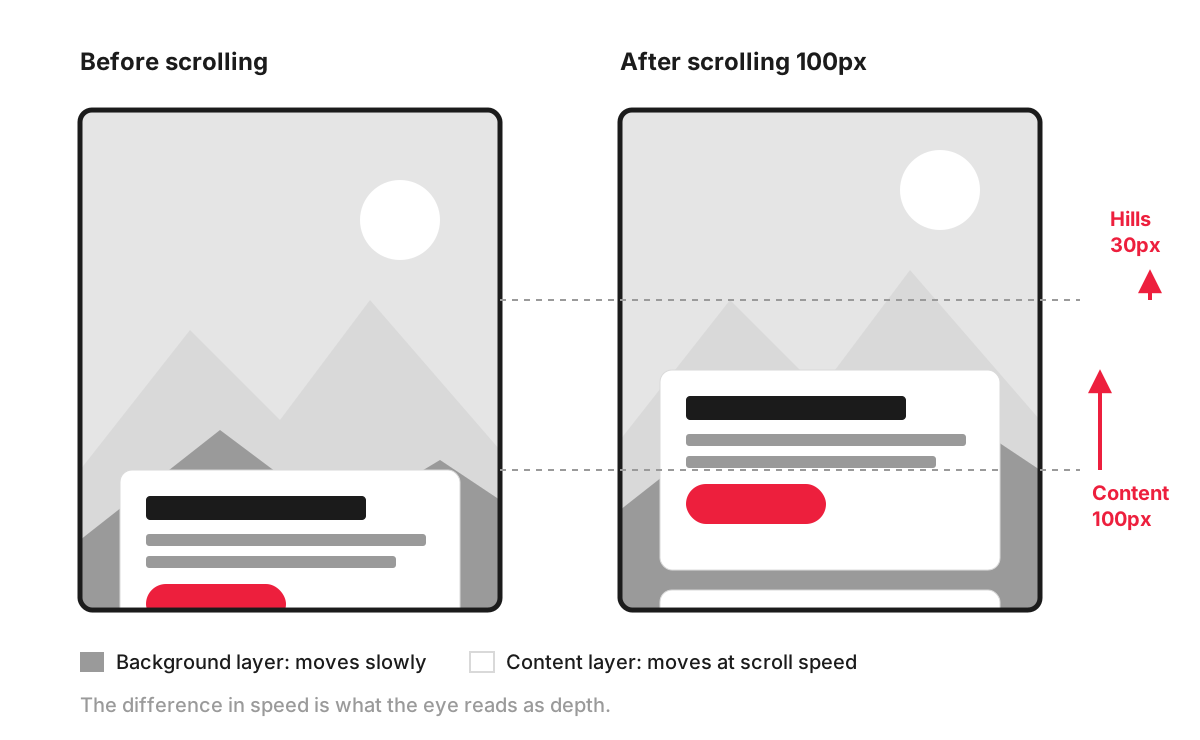
In the illustration, the visitor scrolls the page by 100 pixels. The content card moves up by the full 100 pixels, as everything on a normal page does. The background hills move up by only 30 pixels. That difference is the whole effect; more layers moving at more speeds make it stronger.
There are a few ways to build it:
- A fixed background. The simplest version uses the CSS rule
background-attachment: fixed, which MDN describes as a background fixed relative to the viewport: the image stays still while the content scrolls over it. Strictly, that is one layer standing still, but it is often sold as parallax. - JavaScript. A script reads how far the page has scrolled and moves each layer by a fraction of that distance. This is the most common approach and the most flexible.
- CSS scroll-driven animations. Newer CSS can tie an animation directly to scroll position without JavaScript. MDN currently marks the animation-timeline property as having limited availability, so it needs a fallback for browsers that do not support it.
Where parallax works, and where it gets in the way
Parallax suits pages meant to be experienced as much as read: a product launch, a campaign landing page that tells a story in stages, a portfolio, or a single hero image with a gentle sense of depth. Used once, at the top of a page, it can make a site feel crafted.
It works against the page when visitors came to get something done. On a service page, people want to know what you offer, what it costs and how to get in touch; layers sliding about add nothing to that. Long text over a moving background is harder to read, and moving images can reduce the contrast behind the words. Parallax that draws the eye away from the headline or the main button also weakens the page’s visual hierarchy.
Accessibility: motion sickness and reduced motion
For some people, movement that does not match their own scrolling causes real physical symptoms. The W3C’s guidance on success criterion 2.3.3 Animation from Interactions names parallax scrolling as an animation that is often non-essential, and explains that this kind of motion can trigger vestibular disorders, with dizziness, nausea and headaches. The criterion, at Level AAA, asks that motion animation triggered by interaction can be disabled unless it is essential.
Most operating systems have a setting to reduce motion, and websites can read it through the CSS media feature prefers-reduced-motion. The W3C documents this as technique C39. In practice, the parallax script should not run at all for those visitors, and any CSS movement should be switched off:
const reduceMotion = window.matchMedia('(prefers-reduced-motion: reduce)');
if (!reduceMotion.matches) {
  startParallax(); // only for visitors who have not asked for less motion
}
@media (prefers-reduced-motion: reduce) {
.parallax-layer { transform: none; }
.hero { background-attachment: scroll; }
}The page should look complete without the effect. If the design only makes sense while the layers move, it is too dependent on them. Our entry on web accessibility covers the wider standard.
Performance on real devices
Parallax runs on every scroll, so a poorly built version is felt immediately as jerky scrolling, especially on mid-range phones. The web.dev guide to high-performance animations recommends animating only transform and opacity where possible, because changing other properties, such as top or background-position, makes the browser redo layout or painting on every frame.
Two more checks matter. Large background images used for parallax add weight to the page, so they need to be compressed and sized for each screen. And the effect should be tested on real phones and in several browsers, because smoothness and support vary; see cross-browser rendering.
Parallax and SEO
The movement itself is a visual effect. The SEO risks come from how parallax sites are often built. Long single-page sites with every section on one address give search engines one page to rank for every topic, where separate pages for each service would each have a chance to match a search. And content that appears only after a script runs is harder to rely on than text in the page’s HTML. A parallax hero on top of an ordinary, well-structured page avoids both problems. More on the basics in our entry on SEO.
How we work with it
Motion is easiest to decide before anything is built. In our web design projects, wireframes and clickable prototypes are made in Figma before development, and that is the point to agree whether a page needs any movement at all, and where.
FAQ
What is an example of the parallax effect on a website?
A typical example is a hero section with a photo of hills split into layers: the sky barely moves as you scroll, the hills move a little, and the headline and button scroll at normal speed. Another is a product page where the product image drifts slightly slower than the text beside it as you scroll past.
Why do some people say parallax should be avoided?
Because it is easy to overdo. Heavy parallax can cause dizziness or nausea for people with vestibular disorders, it can make scrolling jerky on slower devices, and it can distract from the content. Used sparingly, with reduced-motion support and good performance, it is acceptable on the right kind of page.
Does parallax scrolling work on mobile?
It can, but it needs testing on real devices. Phones have less processing power than desktops, and smooth scrolling matters more on touch screens. Many sites tone the effect down or show a still image on small screens, which costs little because the effect is less noticeable there anyway.
What is the difference between parallax and other scroll animations?
Parallax is one kind of scroll animation: layers moving at different speeds to suggest depth. Other scroll animations include blocks fading in as they appear, progress bars filling as you read and numbers counting up. They share the same accessibility and performance concerns.